Bringing the truth to light.
PROJECT DETAILS
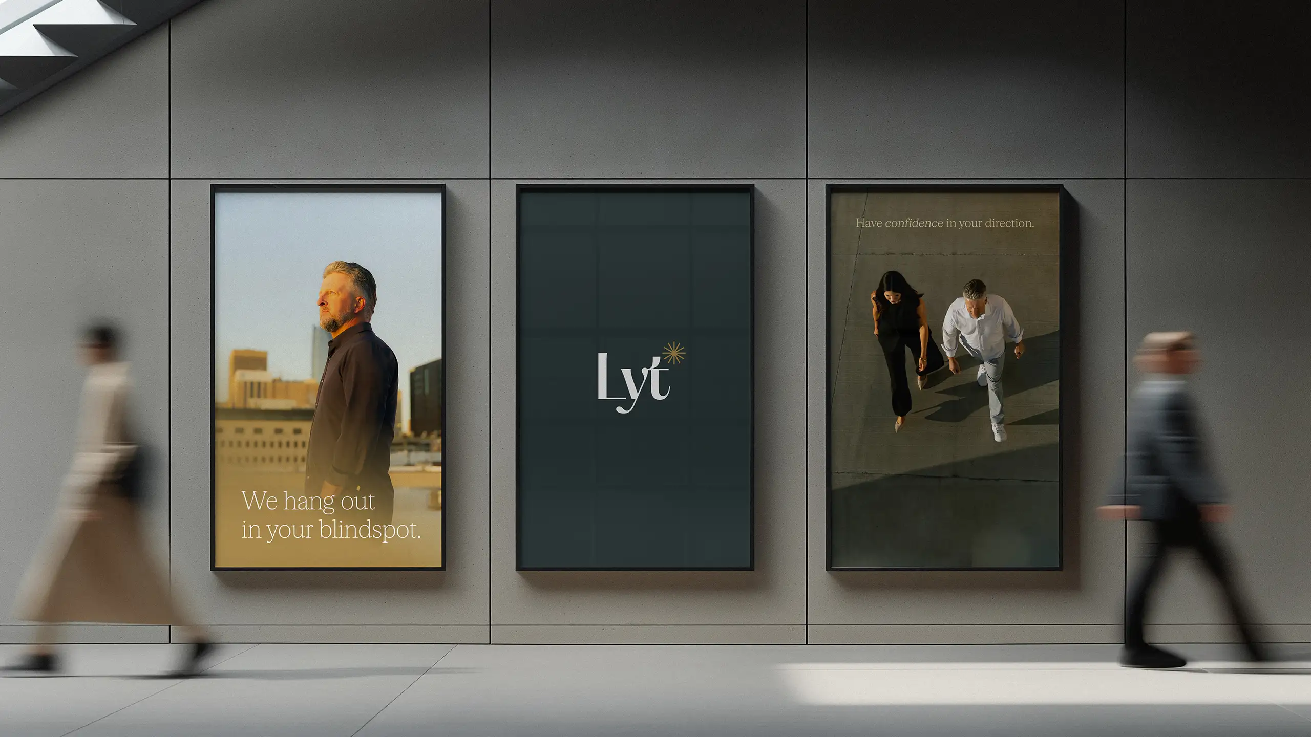
Lyt Consulting Group is a business consulting and advisory firm that actually solves their clients’ root business problems instead of diagnosing the symptoms and calling it a day.
That makes Lyt a business-changer for their clients; but that story wasn’t being told in a way that could resonate with the leaders Lyt sought to partner with.



Aligning from the jump.
Aligning from the jump.
Collaborating closely with leadership, we aligned with the client through discovery and extensive brand exploration to ensure the final product would answer their unique needs and truly feel like “them.” This step was crucial to ensure they would stand completely apart from other consulting firms.
We developed a suite of visual solutions that met Lyt’s needs and gave them options to move forward with.

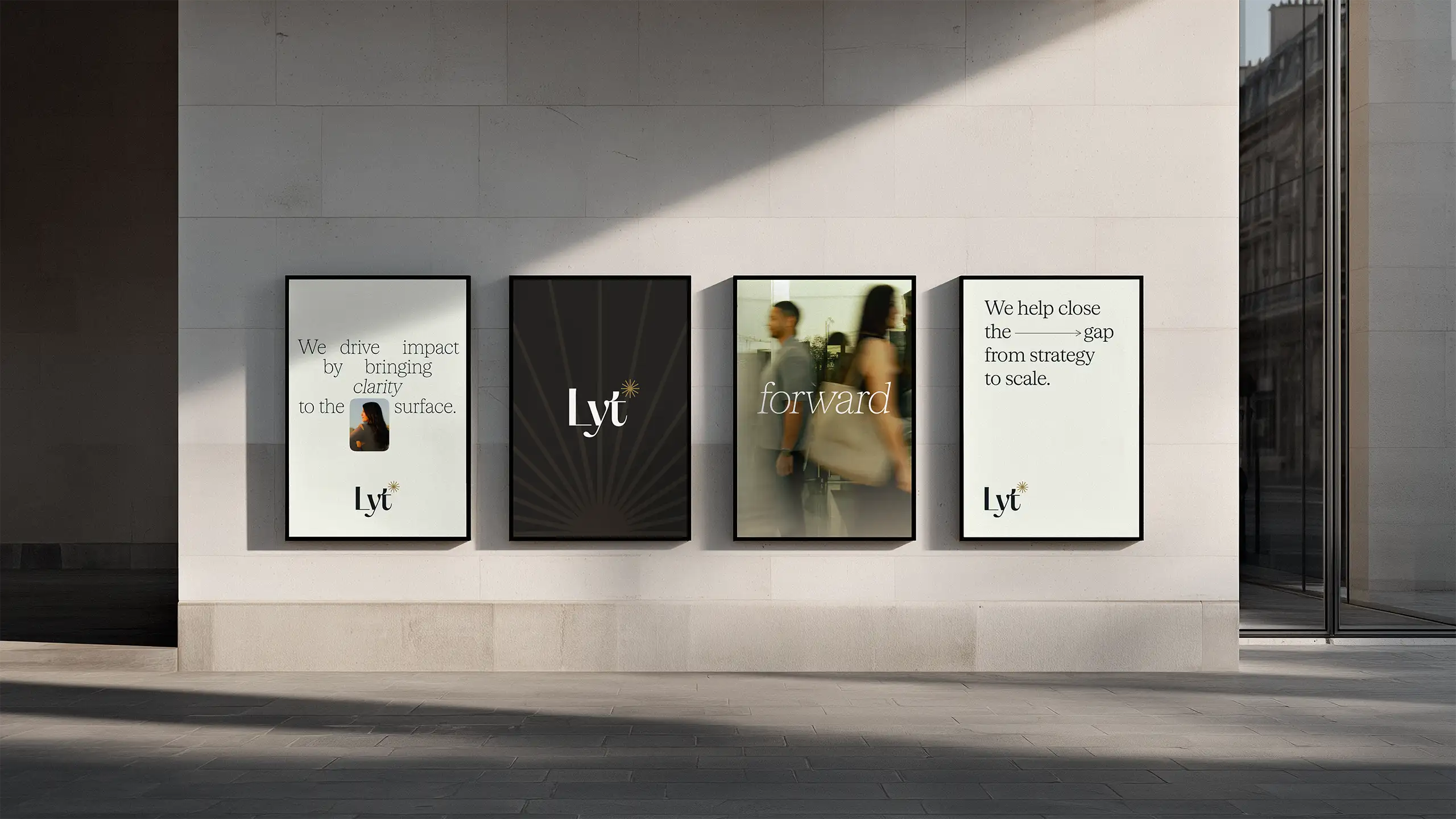
We refined Lyt’s verbal identity to clarify their true value. All messaging flowed from this, ensuring narrative cohesion across the brand.
We refined Lyt’s verbal identity to clarify their true value. All messaging flowed from this, ensuring narrative cohesion across the brand.
Making differentiators clear.
Making differentiators clear.
We developed a brand strategy that would differentiate Lyt as a true partner in their space and distance them from perceptions of their industry that don't fit the value they bring their clients.
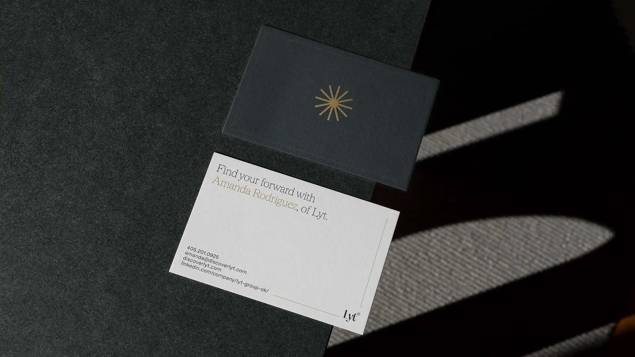
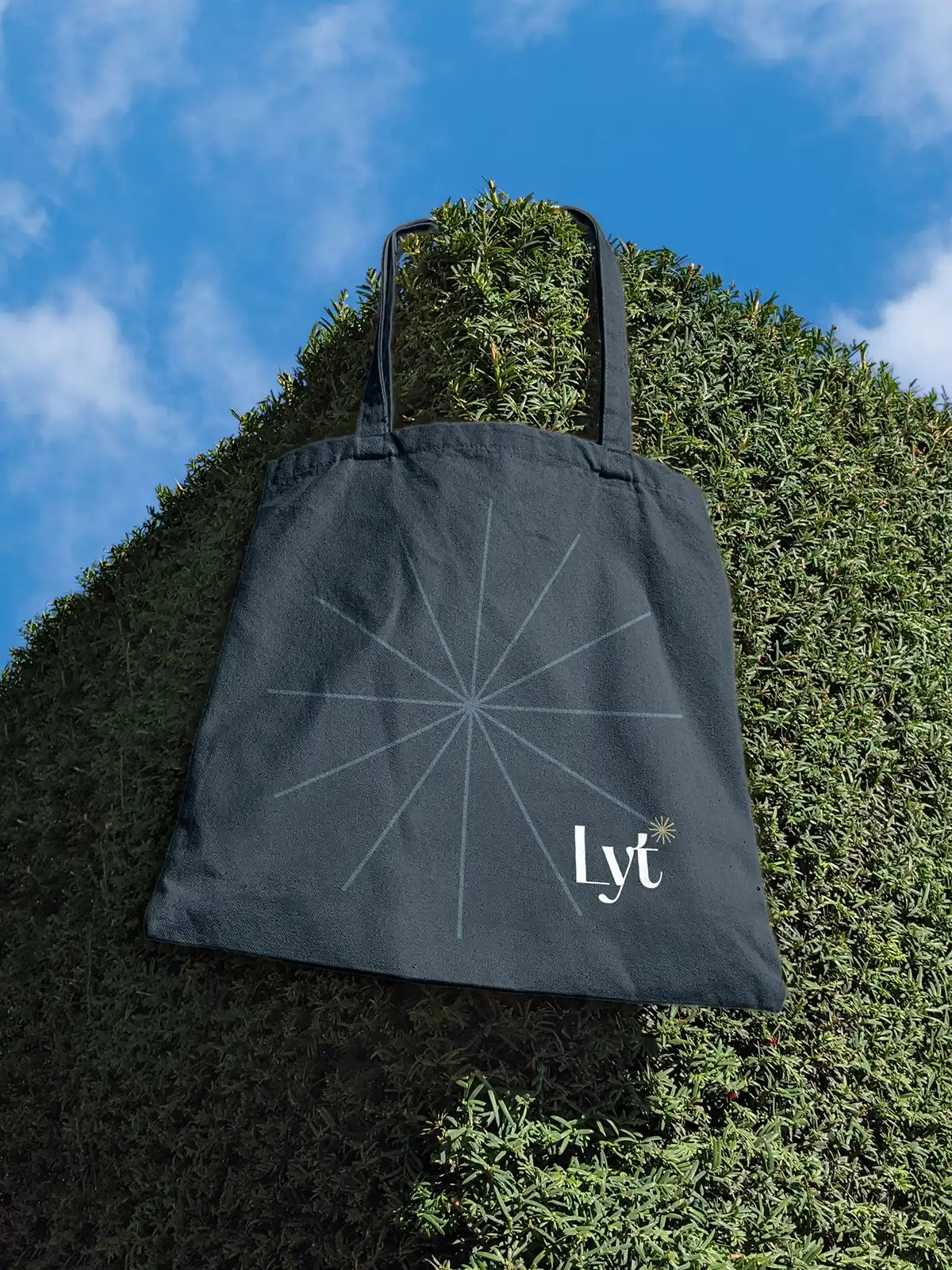
We executed on that strategy with a visual brand identity that worked cohesively with the client’s logo and established a warm but professional presence for the brand. Every element, from the palette to the typography, forsakes the sterile feeling shared by a lot of branding in the consulting space. Messaging was built around the expert problem-solving and supportive partnership Lyt brings to the table, bolstering credibility and trust.

.webp)
A curated photography style allowed us to build on the themes of light, reflection, and partnership that embodies the way Lyt does business.
A curated photography style allowed us to build on the themes of light, reflection, and partnership that embodies the way Lyt does business.






Showing that Lyt brings clarity to chaos.
Showing that Lyt brings clarity to chaos.
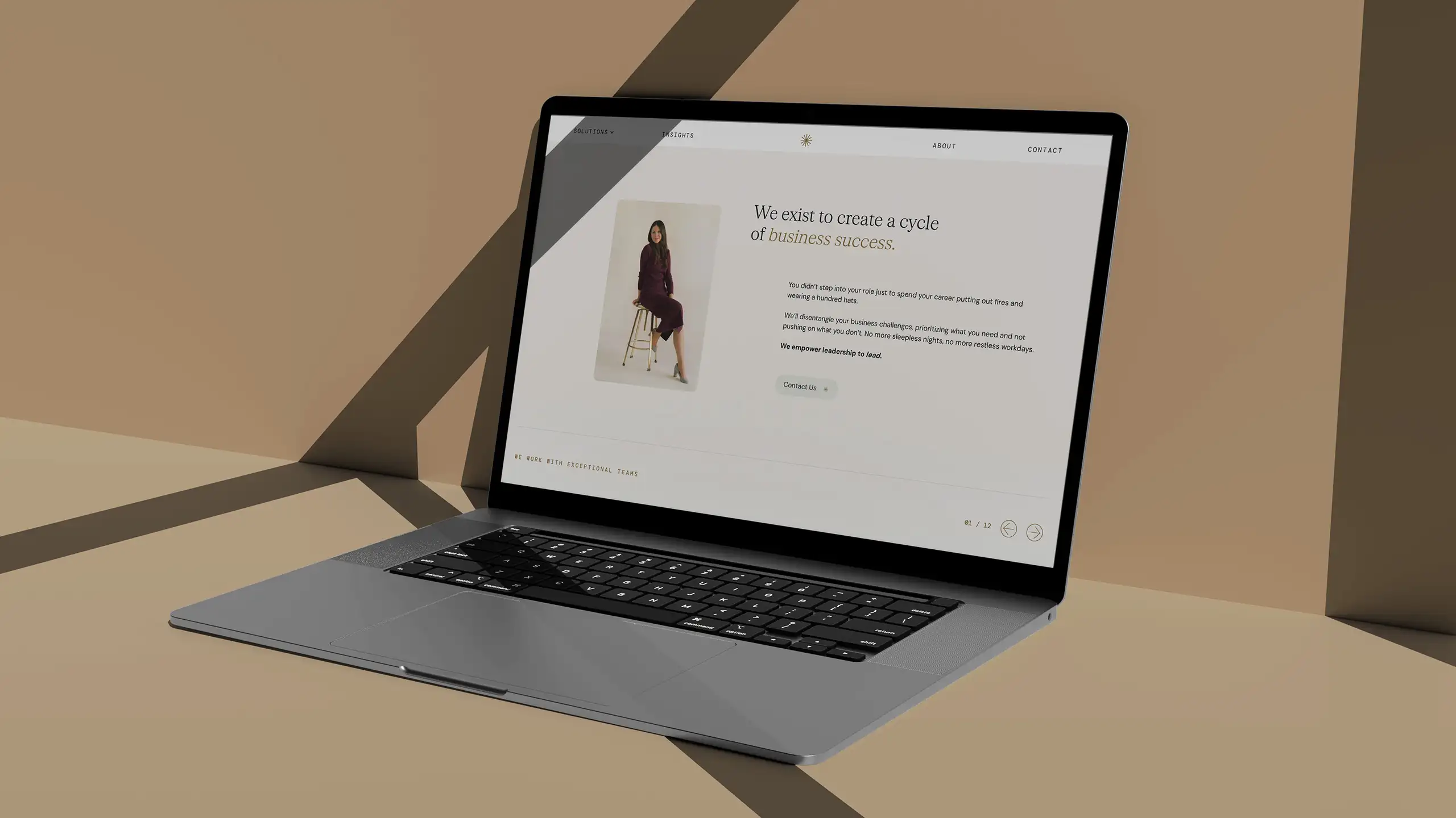
Photography wasn’t the only place we used the theme of “light,” either. Elements that nod to this are incorporated throughout the site, and they weren’t just aesthetic choices. They each speak to the way Lyt shows a path forward to their clients, ensuring design was imbued with their brand message as much as the words on the page were.
Site messaging was built around value, creating a narrative of reassurance: Lyt will lock arms with you, dig into the root of your problems, and solve them in a way no one else can.

Backing up the big reveal.
Backing up the big reveal.
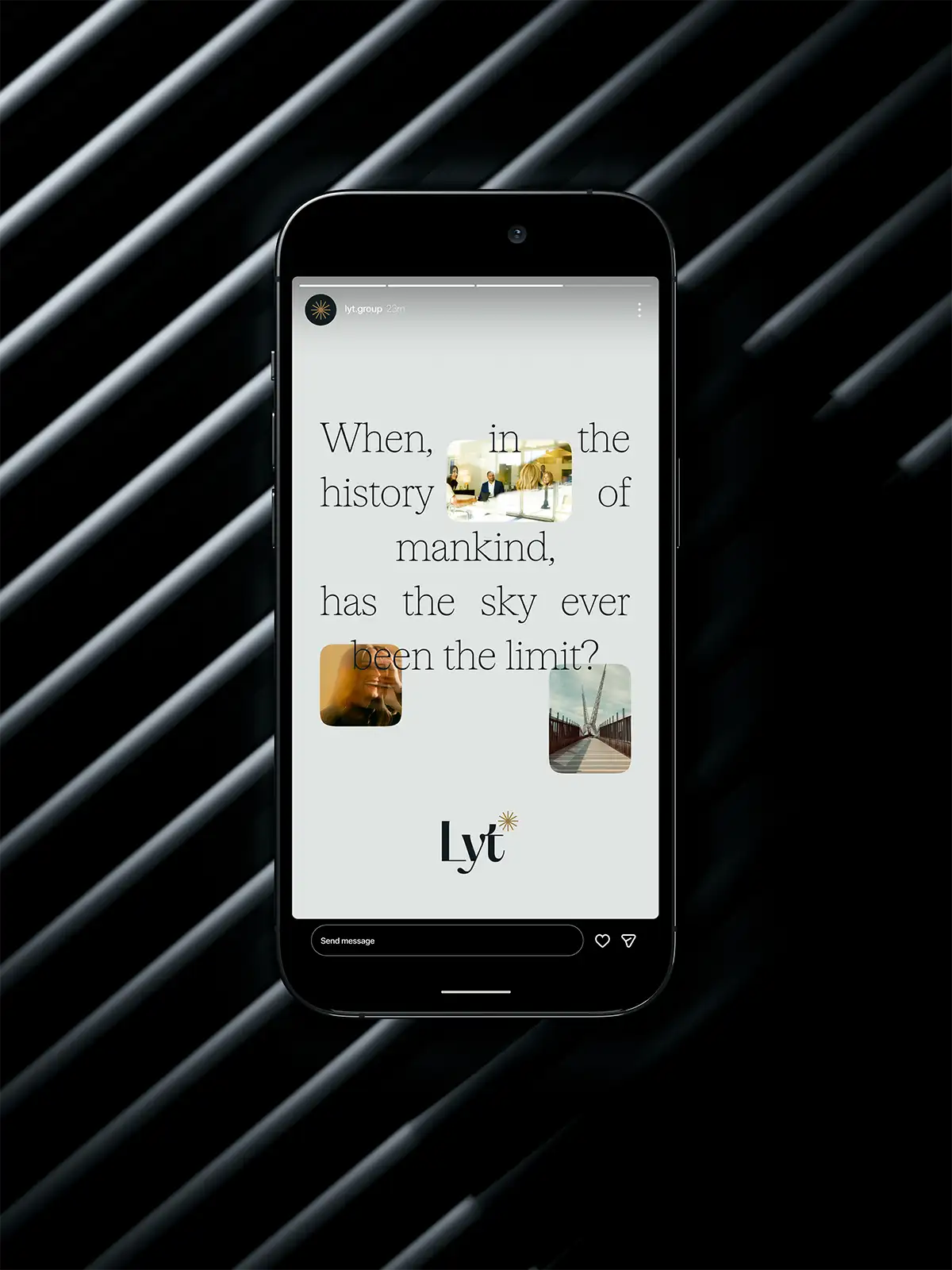
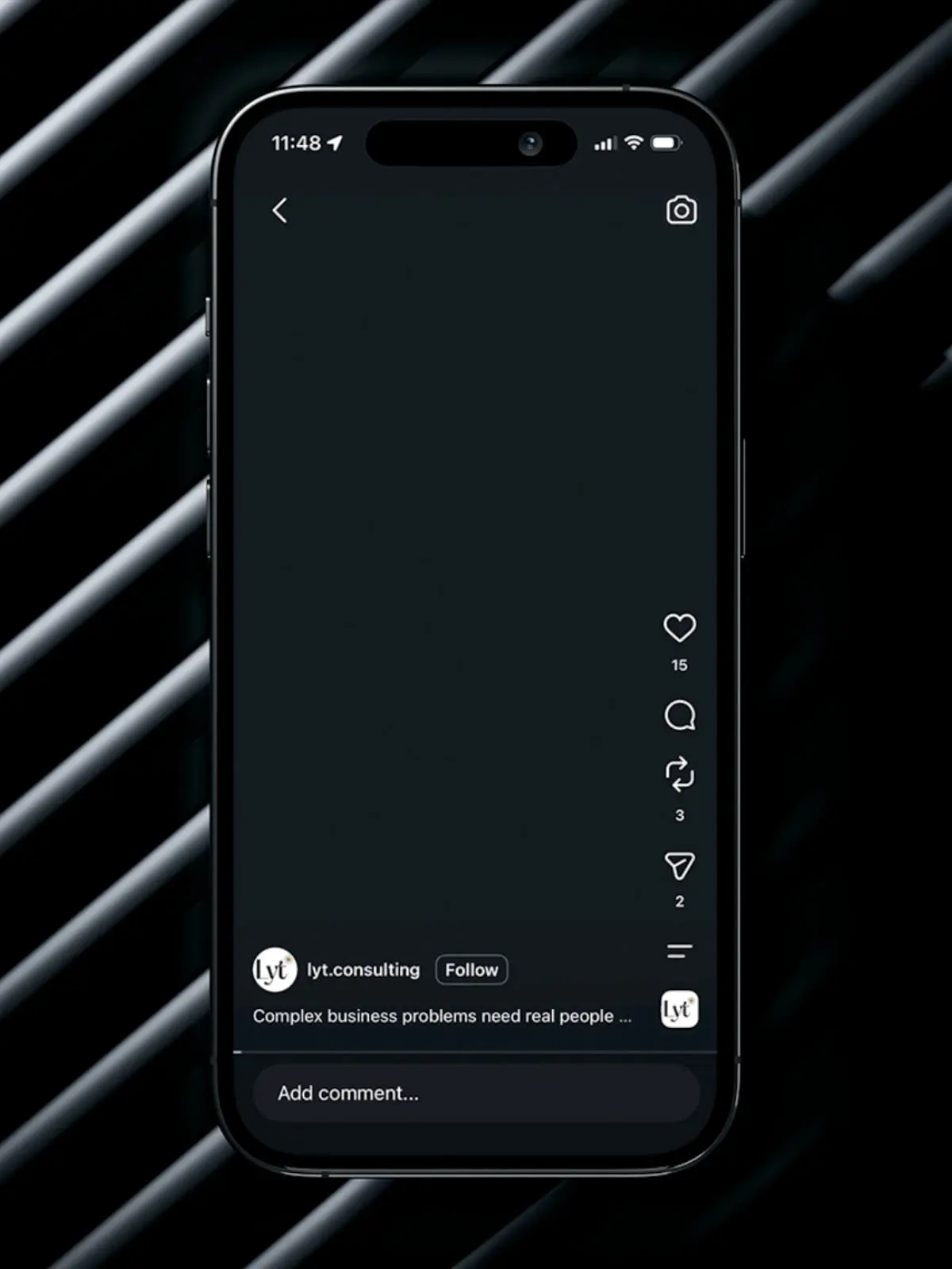
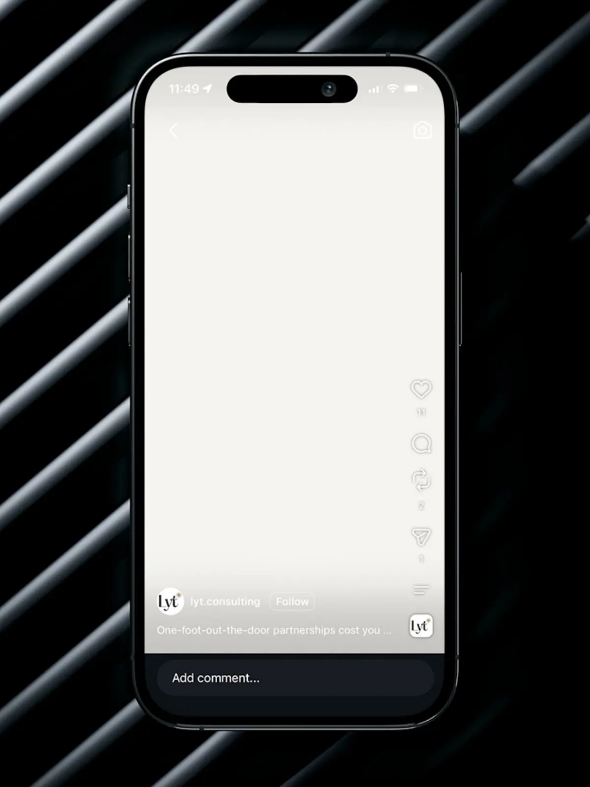
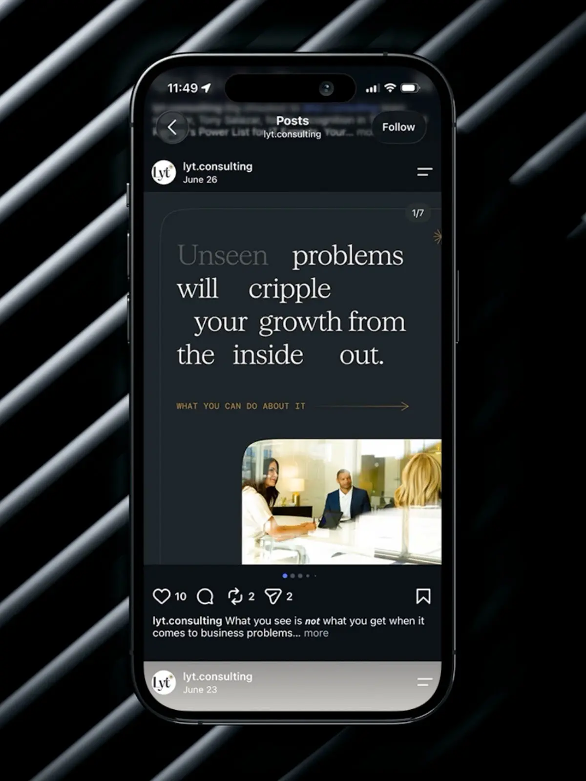
Lyt would need a strong presence on social media as they continued growing. To announce and support the rebrand, we built a rollout social strategy and developed organic posts that established the new identity and its meaning, credentialized their expertise, and clarified their value proposition.
This rollout mirrored the strategy we applied to the rebrand as a whole, prioritizing clarity and audience value in the messaging, supported by professional but approachable visuals.
Results
We helped Lyt capitalize on their differentiators and come forward to their market with more clarity around what they do and how they do it. Fully aligning with them to understand their goals, we were able to develop a full suite of brand materials that positioned them to continue growing their impact.
