The cup of coffee that
landed us in Times Square.
PROJECT DETAILS
Farmer Brothers was a wholesale coffee distributor juggling more than a century’s worth of constant change. This went beyond a rebrand — this was an effort to help align the Bros internally, foster a supportive relationship with their sub-brands, and reconnect them with their true end consumer.
We helped Farmer Brothers evolve their brand to build credibility in a modern setting and give them the look and language that would resonate with their consumers.


The Bros were on their way to the big apple.
The Bros were on their way to the big apple.
But we had some housework to do before we got there — namely, a house of brands strategy. Owning sub-brands is great until managing multiple product portfolios gets complicated. We helped Farmer Brothers identify their overarching product categories and organize them for optimal user experience on their e-commerce site.
We developed a house of brands strategy that put Farmer Brothers in the position to support their sub-brands while stepping up as the leader, and establishing that brand hierarchy smoothed out operations.
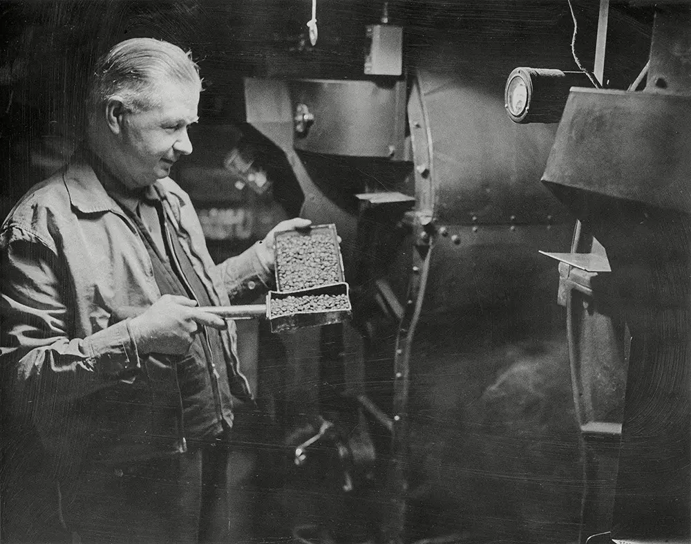
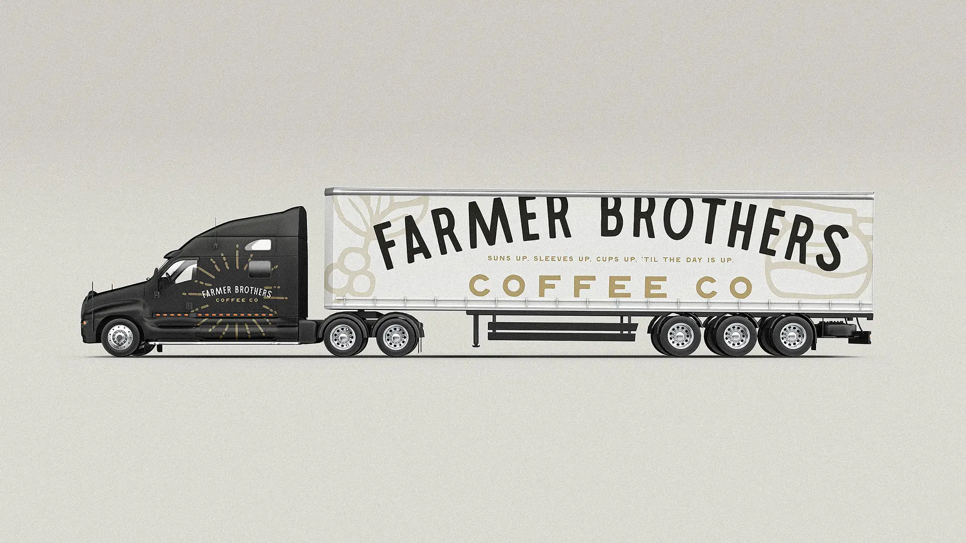
We wish we could look this good at 100.
We wish we could look this good at 100.
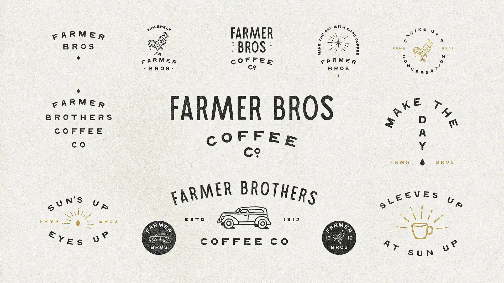

Old, new,
borrowed, brewed.
Old, new,
borrowed, brewed.
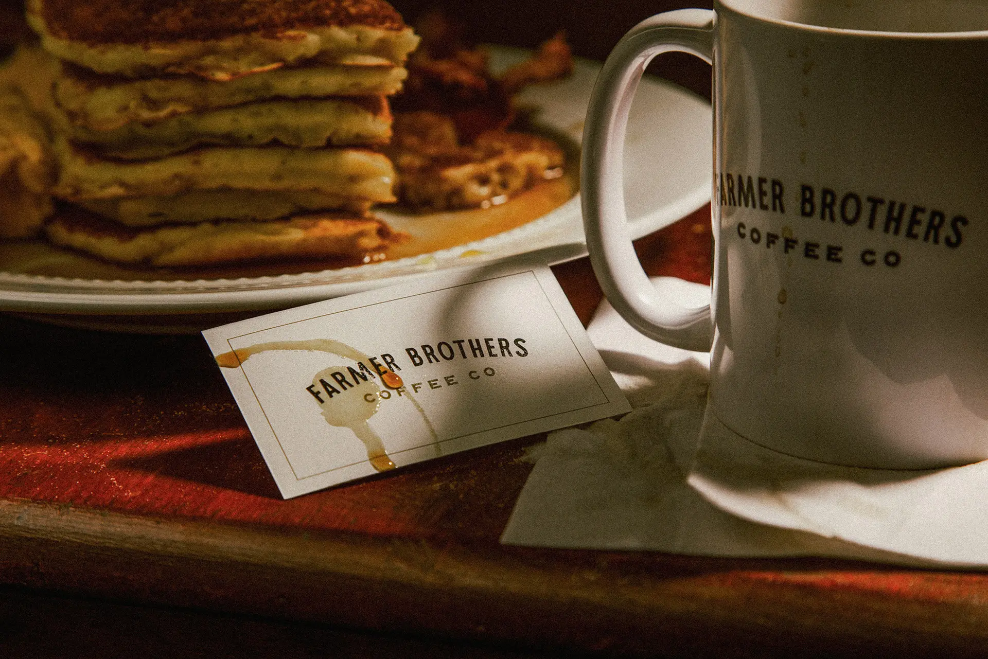
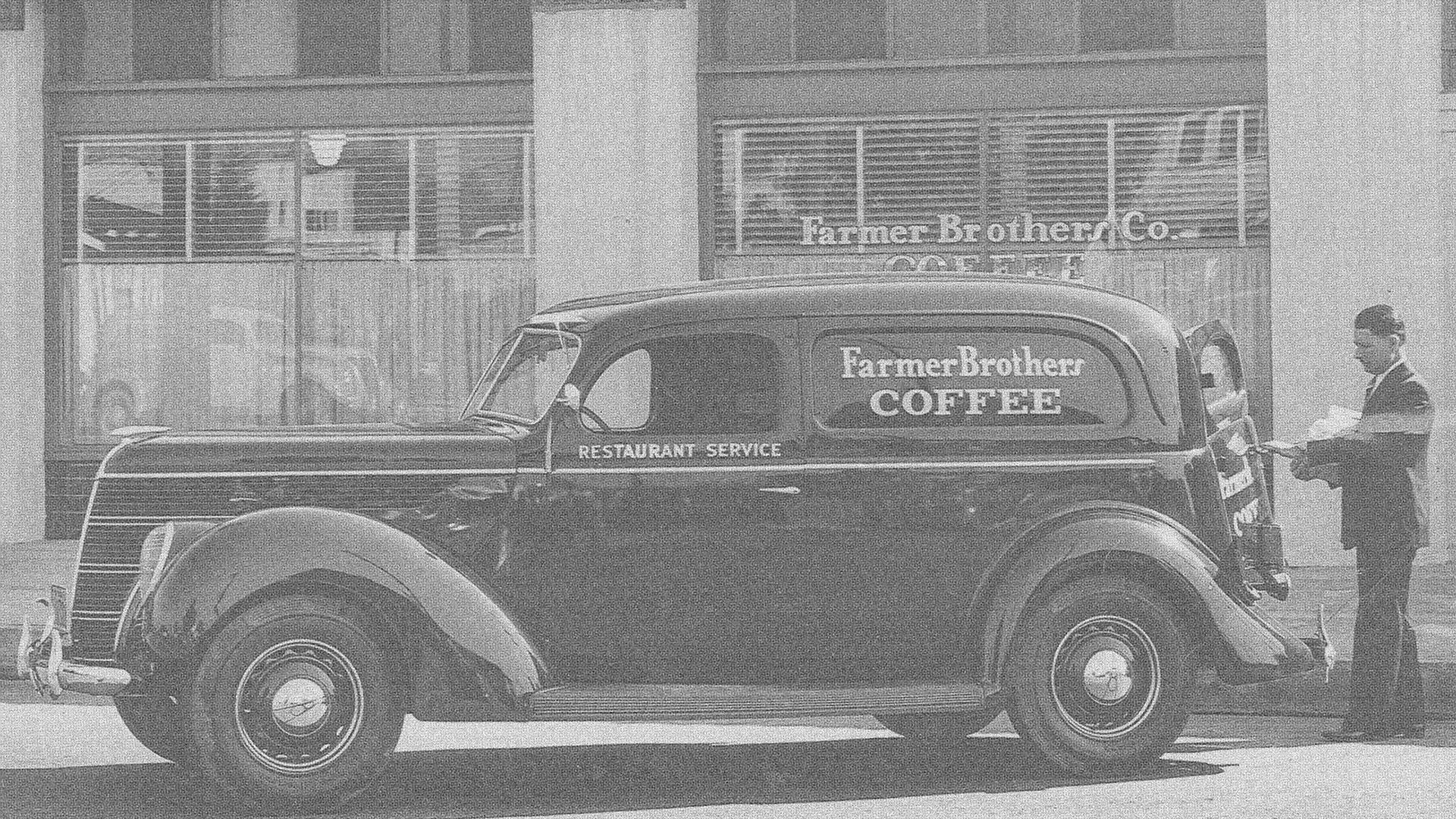
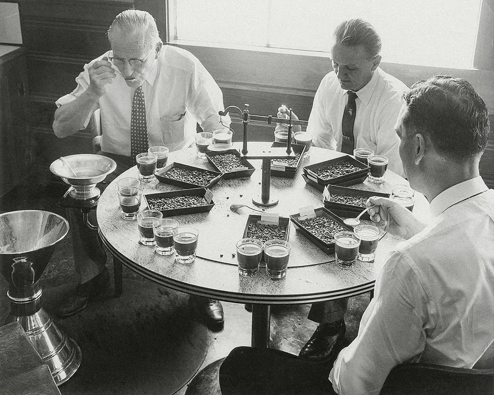
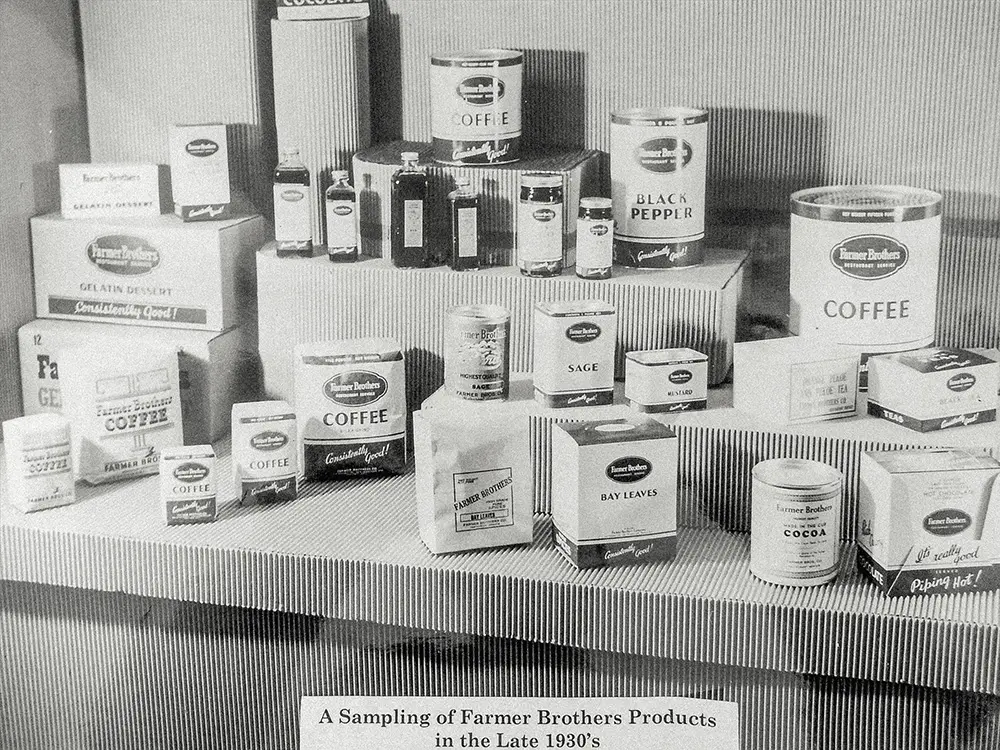
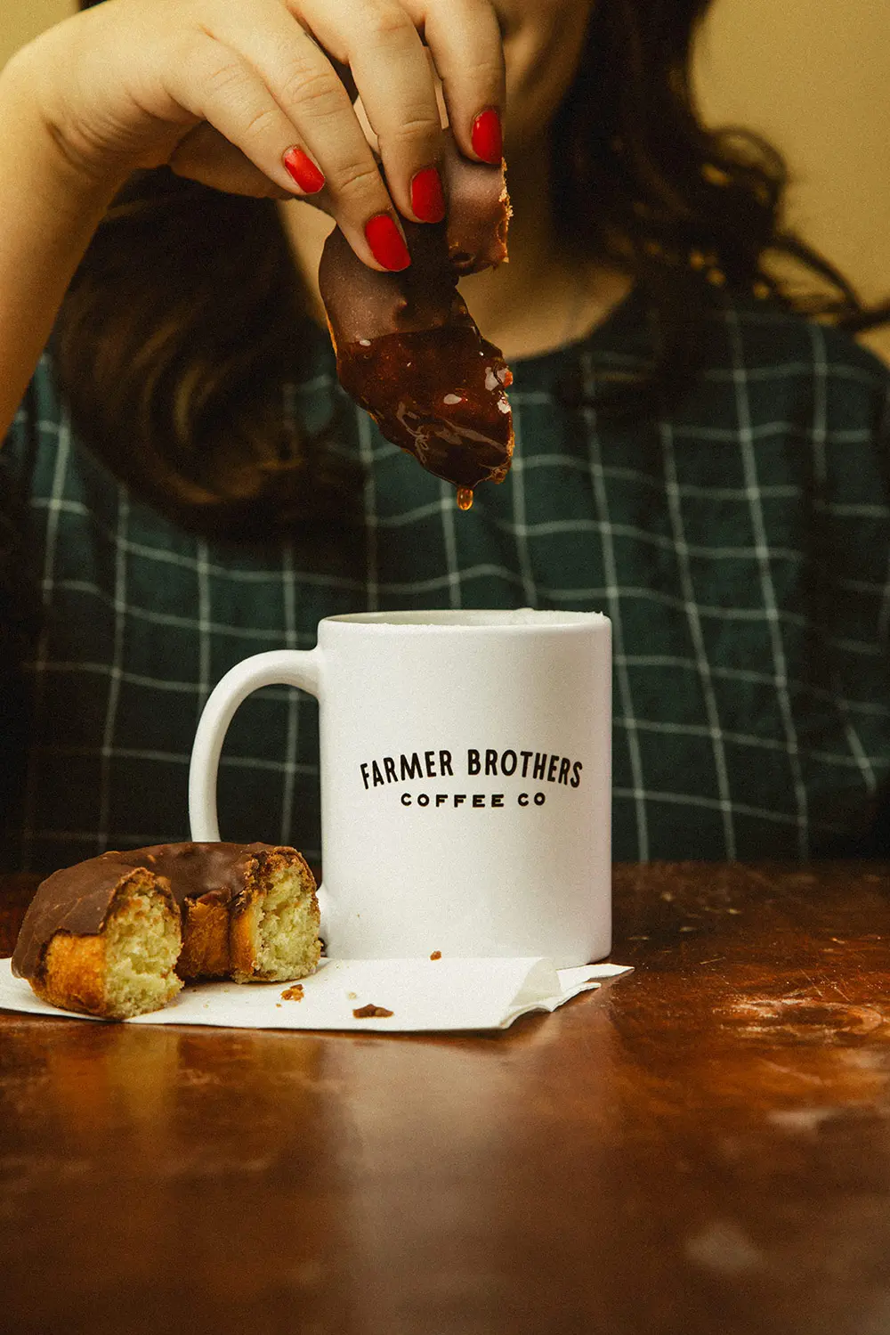
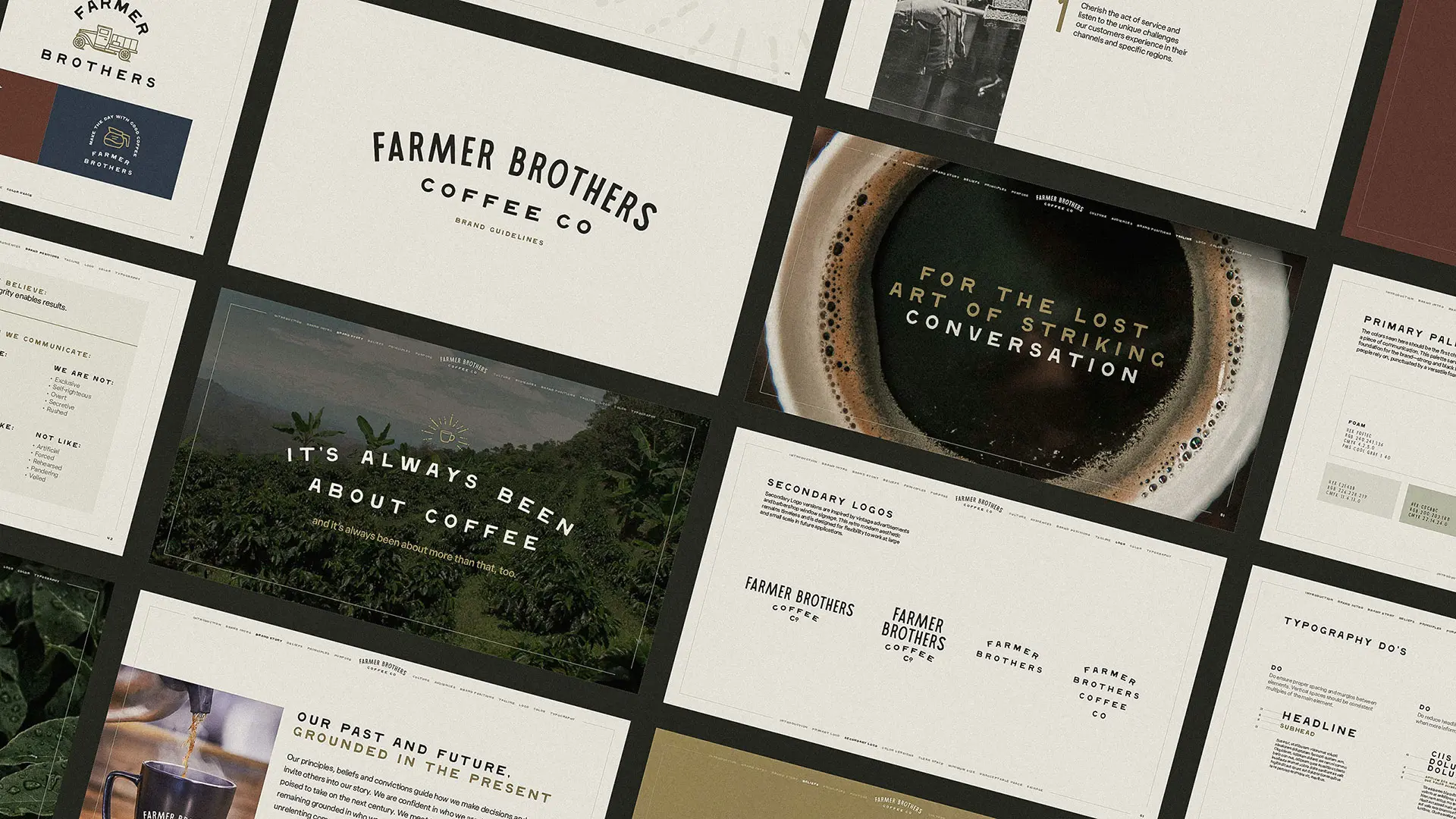
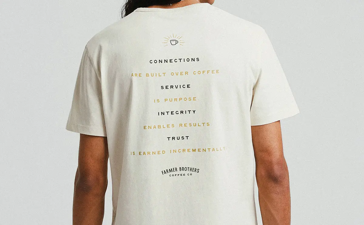
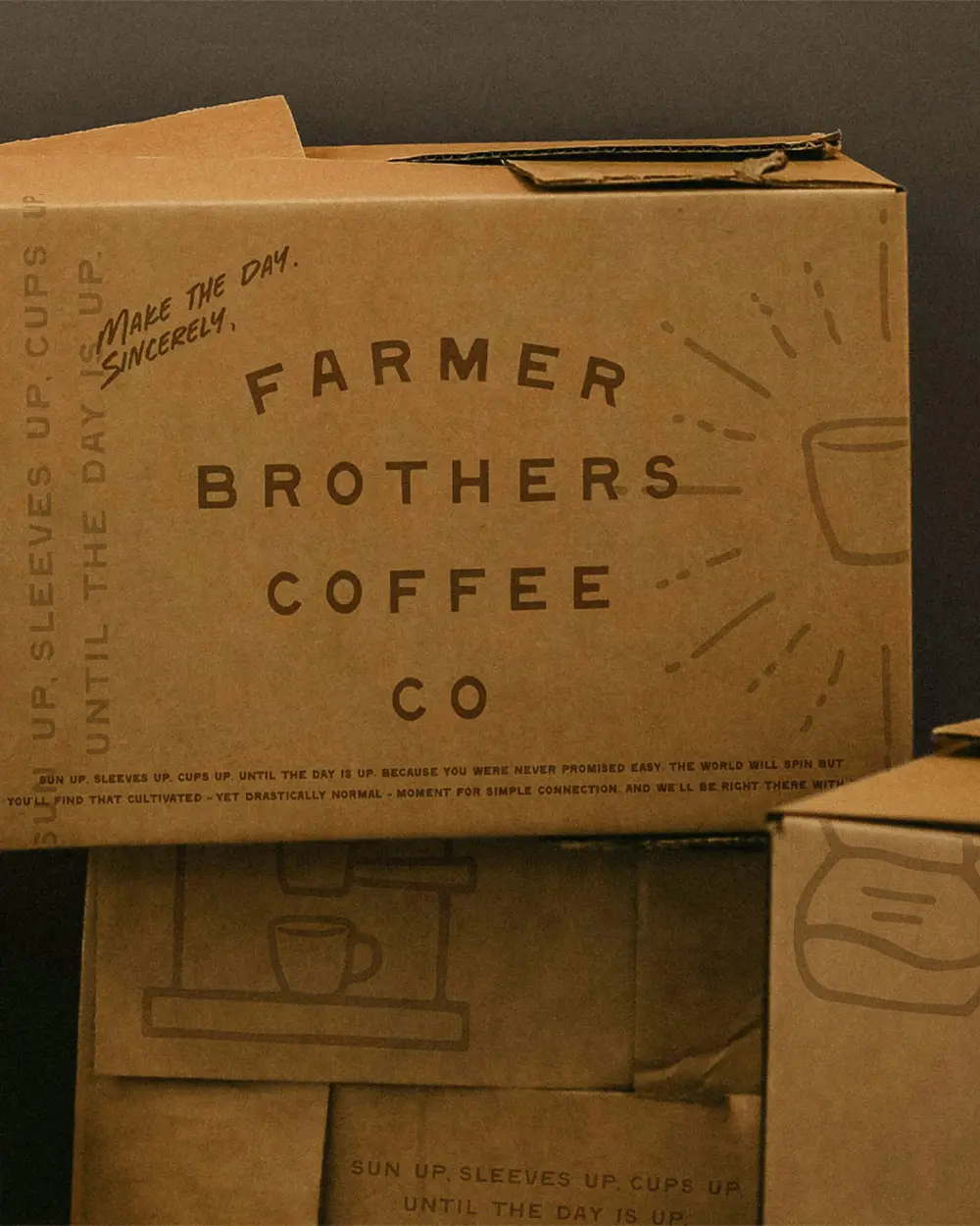
To honor the company’s heritage, we couldn’t abandon a grounded, down-to-earth feel for pure modernity’s sake. But evolving consumer preferences still demand a contemporary touch.
A collection of historic and current photography, an organic primary font, a neutral palette, and animated icons created the cozy-yet-current vibe Farmer Brothers wanted.
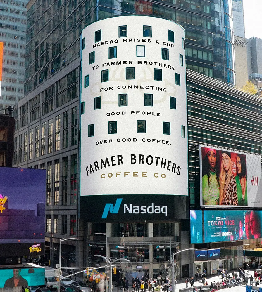
Either you’re seeing double or Farmer Brothers really did grace Times Square twice.
Hint: it’s the second one.
Either you’re seeing double or Farmer Brothers really did grace Times Square twice.
Hint: it’s the second one.
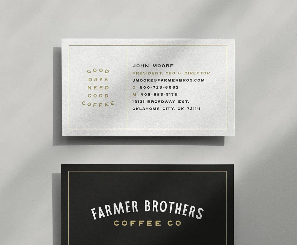
What, like it’s hard?
What, like it’s hard?
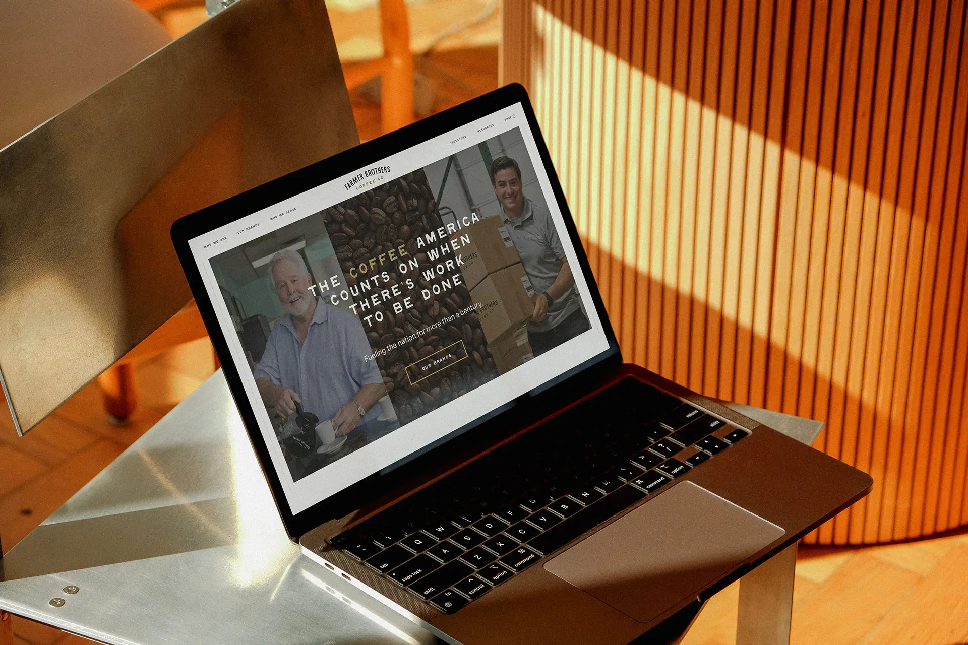
The Farmer Brother’s new site had a laundry list of needs. A filterable library of hundreds of reports, an integrated NASDAQ ticker, an extensive system of internal links, and easy navigation to sub-brand sites were non-negotiable, to name a few.
After designing and building the marketing site, we provided them with a style guide and reference resources to support the development of their e-commerce platform.

You can please everyone.
You can please everyone.
As a national brand, Farmer Brothers has a lot of people to keep happy. We made double sure that the rebrand would exceed expectations.
We held brand-testing consumer focus groups and discoveries with company employees. We analyzed all feedback and ensured the rebrand answered everyone’s needs.


Results
Sticking to your roots and branching out aren’t mutually exclusive. Through in-depth discovery, we were able to identify the misalignment within Farmer Brothers that restricted a cohesive brand identity. We designed the Farmer Brothers brand to honor its history while setting it up for a bright future.
Our house of brands strategy, rebrand and website development allowed Farmer Brothers to communicate with their sub-brands and consumers more effectively, resulting in internal and external alignment.
