Shining up a hidden gem.
PROJECT DETAILS
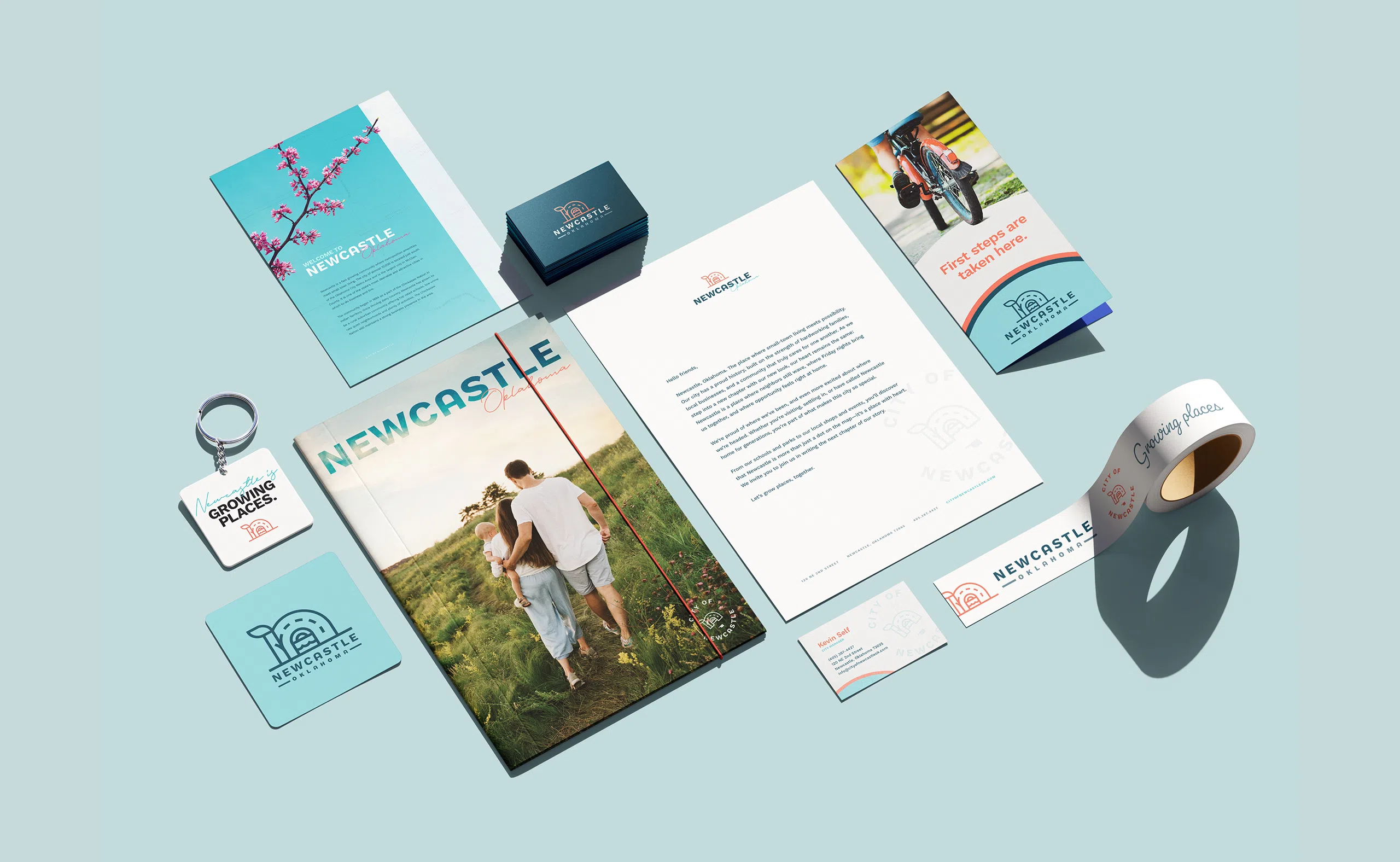
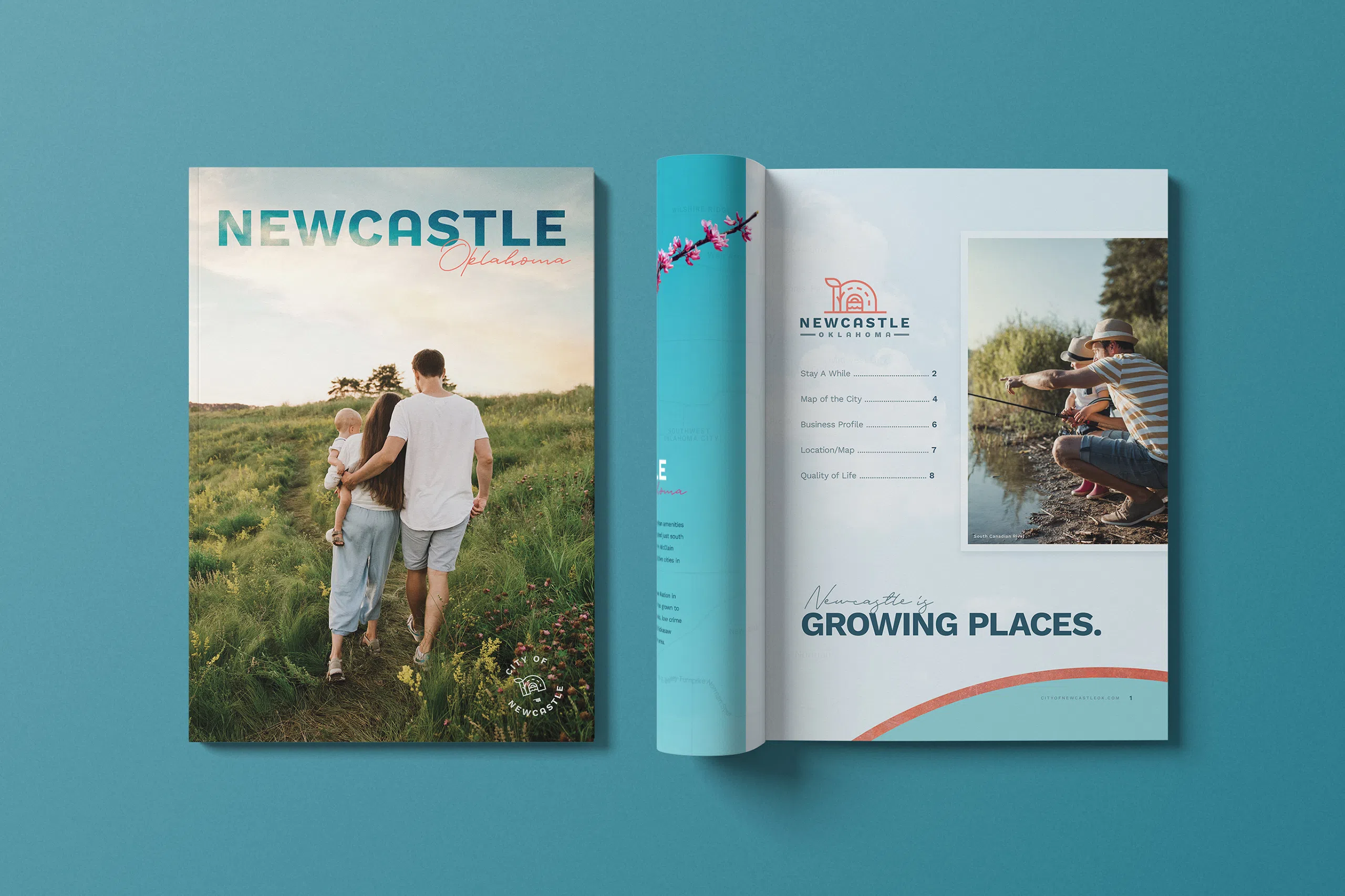
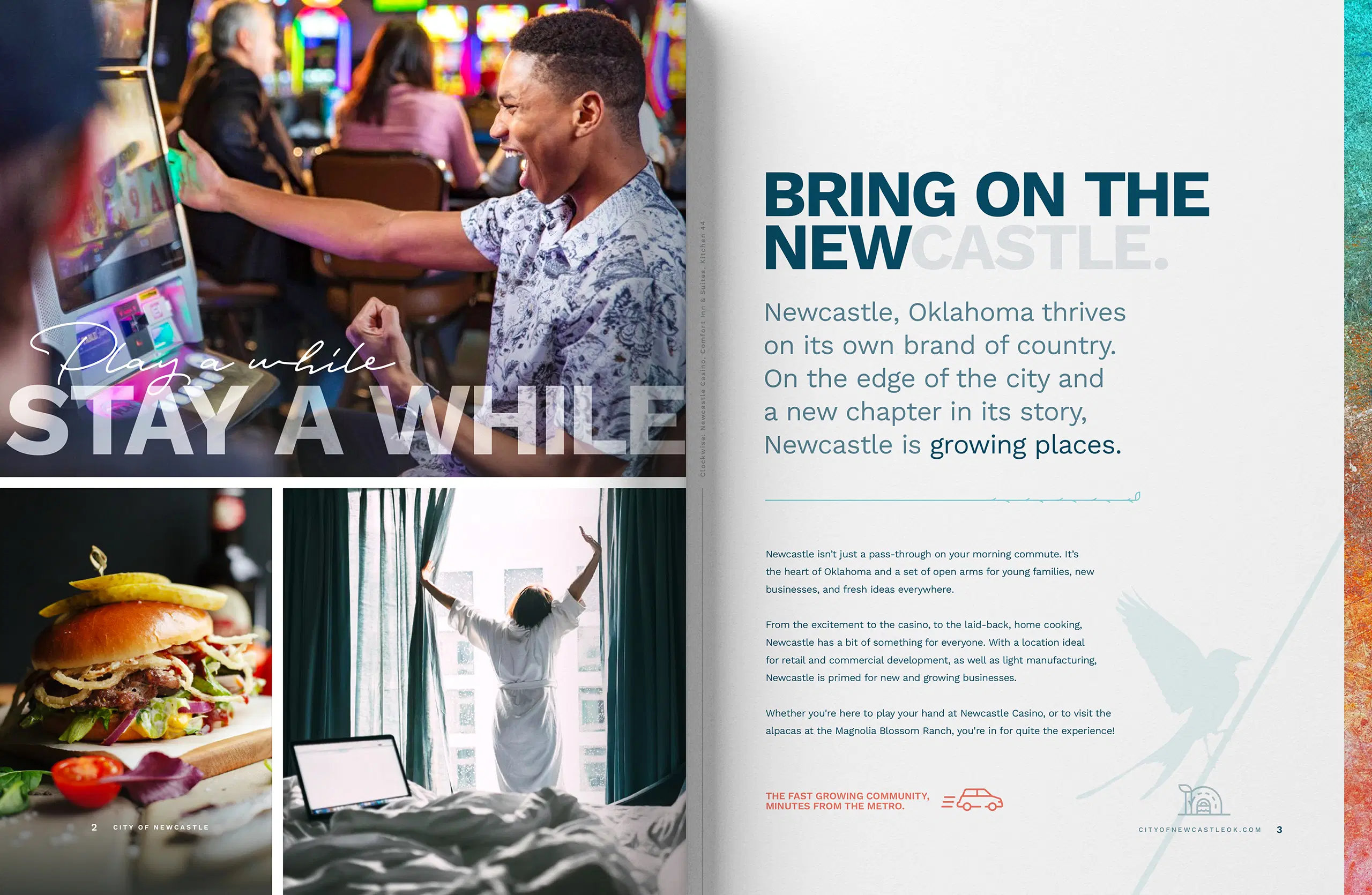
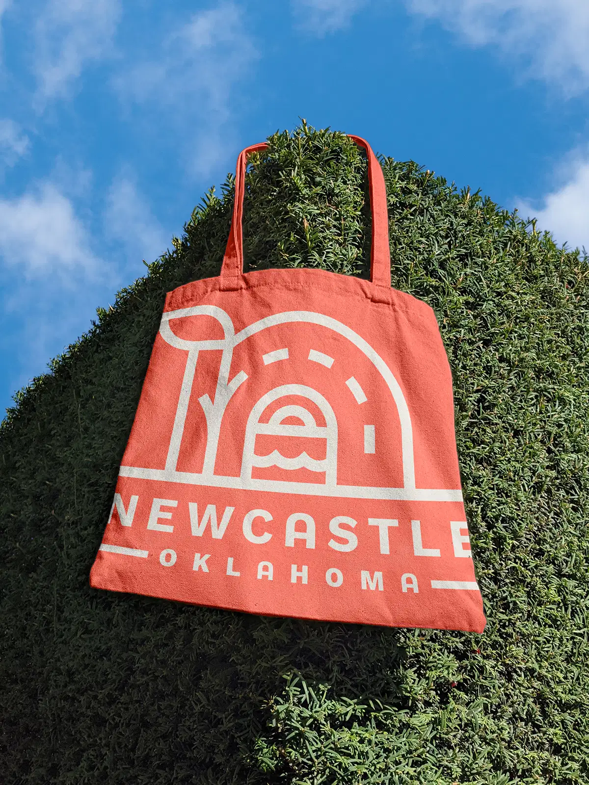
The city of Newcastle is the perfect spot to lay down some roots in a rural community with both small town charm and metropolitan amenities, but it was a little too much of a hidden gem. Wanting to attract more suburbanites to the area, the municipality was ready to modernize the city’s 20-year-old branding while holding on to a homey, human feel.


Slow and steady wins every time.
Slow and steady wins every time.
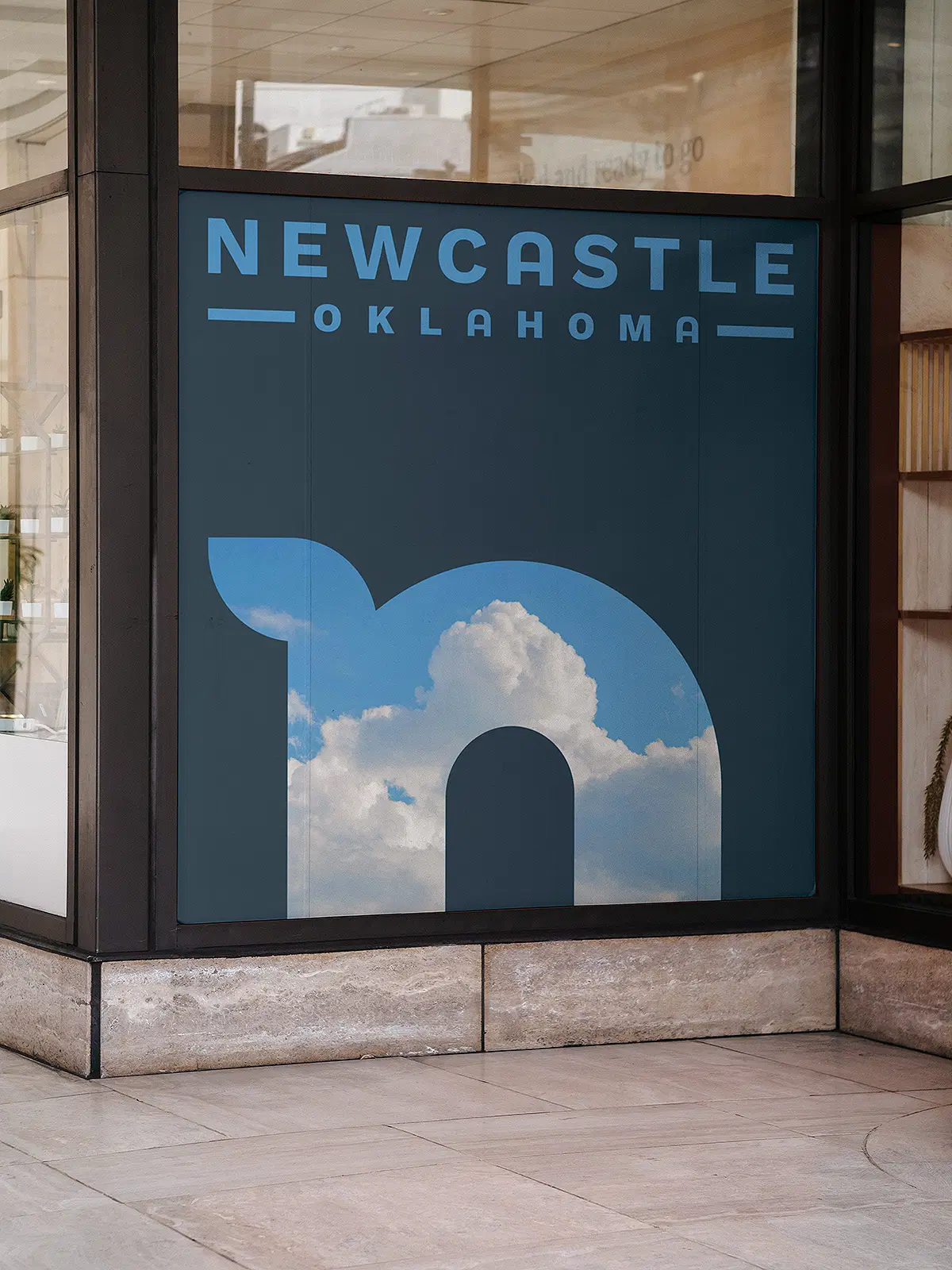
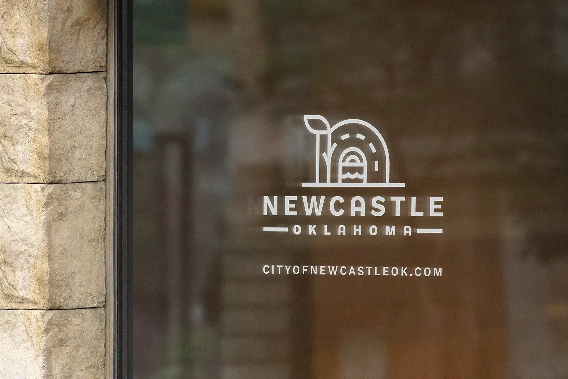
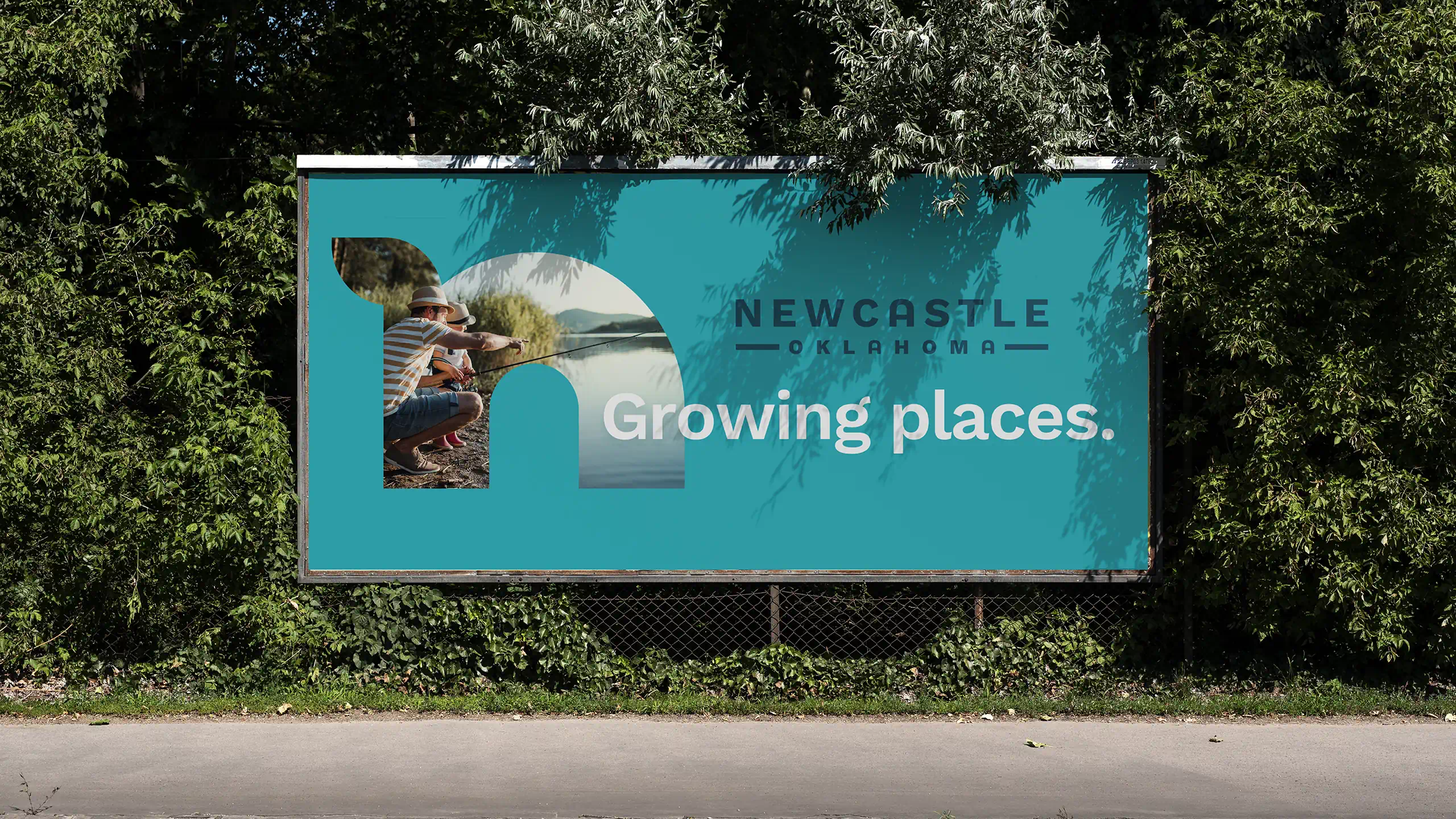
NewCastle is a place where you can enjoy a quiet slice of life within arm’s reach of everything your family needs to thrive. We worked with the municipality and other stakeholders to develop a visual identity that honored the city’s slow, simple way of life. Everything from the color palette and fonts, to the logo elements and photography was built with that in mind.
Results
We helped the city of Newcastle get ready for its next chapter by updating its logo and branding to reflect the life that’s available to residents there — if only they're willing to take the leap and settle in.
